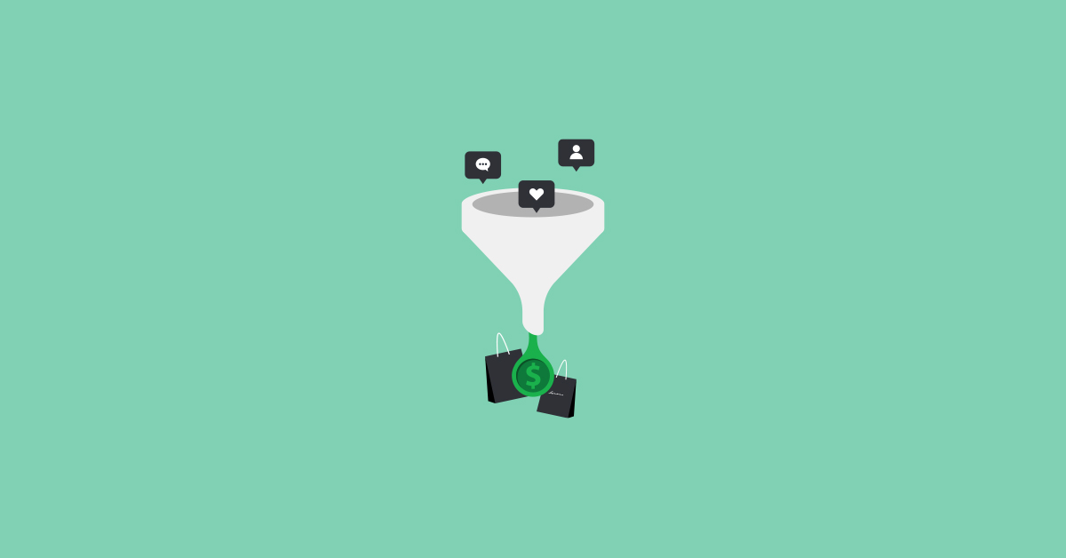
When potential shoppers land on a product page, the hope is they click the call-to-action button and add the product to their shopping carts. Unfortunately, this is not always the case. In fact, 84% of website visitors abandon a site after viewing product pages.
Ever asked yourself why shoppers view product pages and then just leave without anything purchasing? The answer lies in what you’ve placed on your product page. So, let’s analyse why product pages have such high bounce rates and explore ways to drive shoppers closer to conversion.
The 3-Second Test: What makes a poor product page?
40% of visitors abandon a site if it takes more than 3 seconds to load — that’s how much time you only have to keep your customers interested. This helps you understand which elements of your website need work. To optimise your website, you need to understand first what your customers are experiencing.
Within 3 seconds, glance over your product page and put yourself in your customer’s shoes. Then, ask yourself these things:
- Could you tell what the product was for without reading the entire description?
- Was I impressed?
- Did everything load properly on or before 3 seconds?
- Did you know what the next step was after viewing the product page?
If you answered “no” to any of the questions above, then it’s you should consider optimisation. Below is a rundown of the best practices to create a highly converting product page:
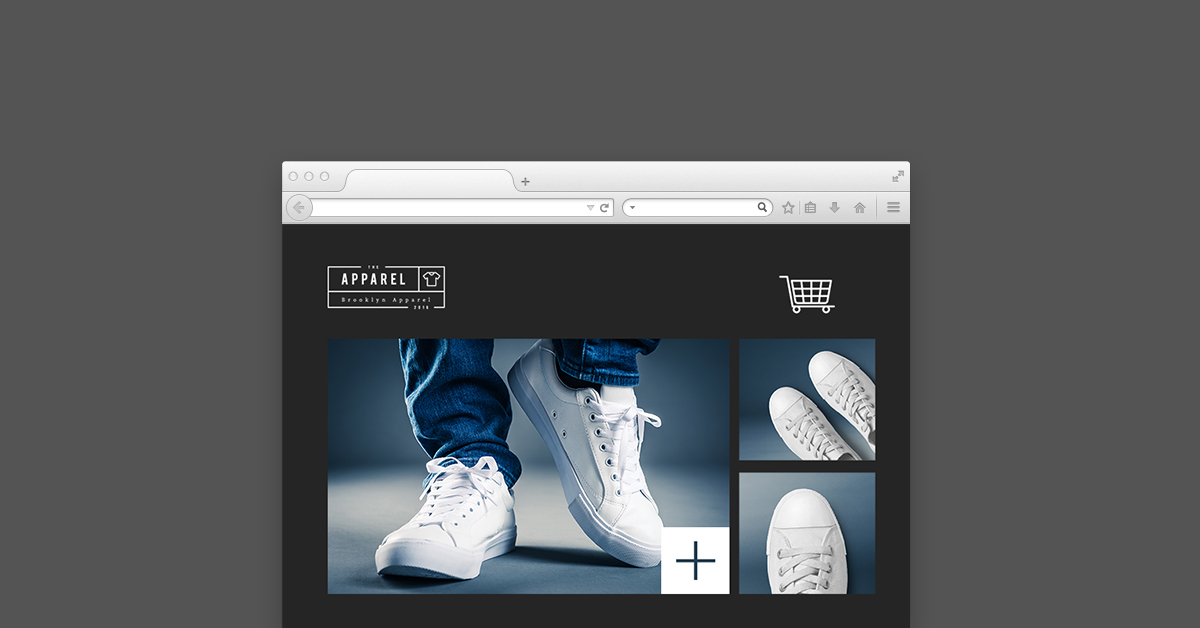
Use multiple angle shots for product images
Product image is the holy grail of any product page. After all, it’s unlikely you will buy a pair of jeans without actually seeing what that dress looks like. It answers a lot of questions in a visitor’s mind, thus preventing confusion and builds trust for your brand. So display multiple angles and sides of the product.
And remember: the larger the image, the better — larger images boost conversions by up to 63%. If you don’t have the creative space, you can use zoom options with high-resolution photos as an alternative, as with Uniqlo:

Human-like, friendly content
For any great image, there should be equally engaging content to ensure you sell. Your content will fill any gaps that your photos don’t. Shoppers in physical stores like to ask salespeople to know more about the product features and benefits. So use the same descriptions that would otherwise be used in the in-store environment — polite, engaging and personal.
Be authentic with your style of writing to establish your own voice.
Upsell and cross-sell relevant products
Although the main objective is to sell your inventory, it shouldn’t prevent you from promoting other items that might stir the interest of your shopper. It’s also a good way to engage with your visitors and help them with their shopping needs.
You can recommend relevant products to your shoppers by using upselling and cross-selling techniques that can also help you maximise your average order size and revenue by up to 70%. Shoppers love variety so ease their shopping by displaying products that complement the product that they are currently viewing.
Create a clear ‘Call To Action’
The main goal of a product page is to drive your visitors into hitting that call-to-action button. It could be “Buy Now” or “Add to Cart” — regardless of the CTA, it should be clear as day. Your CTA button should stand out from the whole product page to avoid any distractions or obstacles that prevent the visitors from hitting the “Buy” button. Macy’s bold red CTA, for example, is direct and a standout from the whole product page.

Increase trust with engagement and reviews
Social proof is the underlying principle that explains why shoppers love to seek advice from someone they know before buying a product. This is the reason why putting social proofs such as reviews and testimonials are pivotal in the decision to purchase. In fact, reviews and testimonials have been found to increase sales by 18%.
Shoppers check for guidance from previous buyers to make sure that the selected products are exactly what they are looking for, so include product reviews with products. You can use tools such as Sales Pop as an alternative to creating popup notifications.
Creating a sense of urgency and scarcity
Supply and demand are the two fundamental laws of economics. Scarcity is the psychology that a product is limited so it may run out anytime. Urgency, on the other hand, is the psychology that a product is so popular that a significant number of people demand it. You can use the psychology of supply and demand into your product pages as a way to encourage shoppers.
To maximise your conversions, use messages like ‘Only two left’ or ‘Deal expires in 1 hour’. You can create a countdown offer with Checkout Boost to motivate shoppers to complete their purchase by offering them an incentive with a countdown timer just like how Servedfreshcollection did:

Get Optimised, Win More Sales
Keeping focused on elements that matter such as using multiple angle photos to visually display your product, writing content that resonates with your audience, and display clear CTAs. Additionally, you can help them with their shopping needs by suggesting relevant items, adding social proofs, and ultimately convert them

News you care about. Tips you can use.
Everything your business needs to grow, delivered straight to your inbox.